Making the book
How to choose a photo book cover
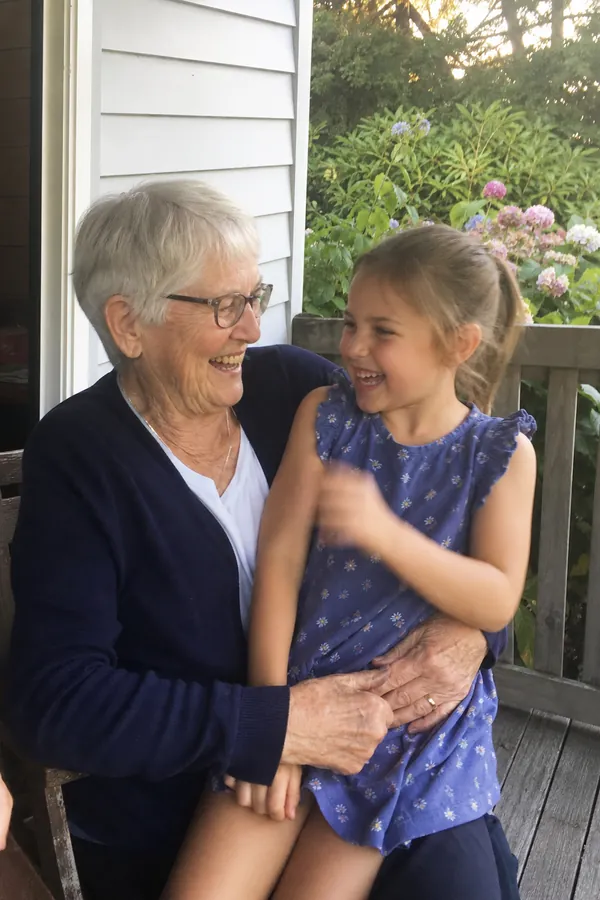
The cover is the only page everyone sees, including the people who never open the book: it sits on the coffee table, face up. Three decisions make it: the photo, the title and the design.
The photo
Choose a photo of the person the book is for, with someone they love. Not the group shot. Twelve people on a cover are twelve small faces, and the photo of everyone belongs inside.
- Close enough to see expressions. Two faces is ideal.
- Upright if you have one. The cover is taller than it is wide, and an upright photo fills it better.
- Sharp. The cover is where a soft photo shows most. Use an original from the camera roll.
- Not too recent to be flattering. They will show this to everyone. Pick one they'd pick.
In the studio, any photo in the book can be made the cover with one tap.
The title
"For Nana" is hard to beat. The title is what the family calls them, not their full name. If the book marks an occasion, put that in the line underneath: "With love from all of us, on your 90th birthday." Keep the title under five words so it prints large.
The design
Paper Chain has ten cover themes. They differ in colour, typeface and layout; the inside pages stay white with dark type in all of them. In the studio you see your own photo and title on all ten at once.
- Forest, Midnight, Linen: quiet and classic. Good for anniversaries and big birthdays.
- Gazette: the title set like a newspaper masthead. Good for a year-in-review.
- Scrapbook, Airmail: playful. Good for books from grandchildren, or to someone overseas.
- Marigold, Studio: bold and modern.
- Clay, Rose: warm. Popular for Mother's Day.
Softcover or hardcover
Softcover is lighter and cheaper and arrives a few days sooner. Hardcover has stiff boards and feels like a keepsake. There's a fuller comparison in softcover vs hardcover.
If you make a book every year, keep the same theme and put the year in the subtitle. They'll sit on the shelf as a set.