The book
Designing a photo book for older eyes
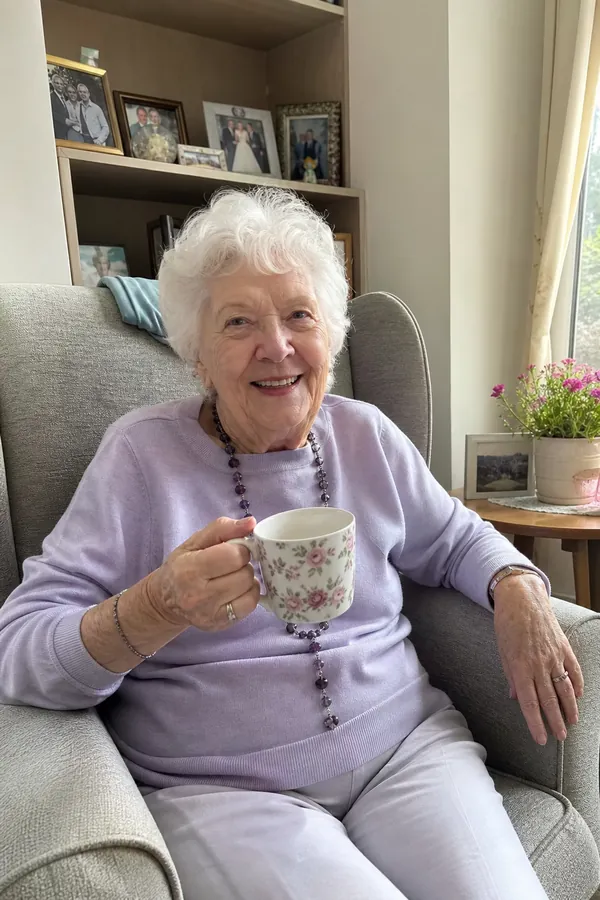
Eyes change with age in predictable ways. The lens yellows and lets in less light, focusing up close gets harder, and glare becomes more troublesome. A book that ignores this gets admired once and put away. A book designed around it gets read.
Type that's big enough
Most books are set at 9 to 11 point. Large-print books start at 16. In a Paper Chain book, captions are set at up to 18 point and notes at up to 20, shrinking only when there's a lot to fit. A short caption is printed bigger than a long one.
Contrast
Pale grey type on white looks elegant on a designer's monitor and disappears under a reading lamp. The pages inside every Paper Chain book are white with dark type, whichever cover theme you choose. Words are never printed on top of a photo.
One thing per page
Collage layouts shrink faces and make the eye work to find its place. One photo to a page means every face is large, and there's never a question about which caption belongs to which picture. A longer caption gets the facing page to itself.
Matt, not gloss
Glossy paper reflects every lamp and window. The cover has a matt finish, and the inside pages are a silk-coated paper that holds colour well without shining.
Margins and line length
Wide margins keep words clear of thumbs and of the fold in the middle. Lines are kept short enough to read without losing your place on the way back to the left edge.
Names, always
This one is up to you, not the designer. A caption that says who is in the photo helps the reader, and it helps everyone who reads the book with them: the neighbour, the carer, the great-grandchild in twenty years.
Size and weight
The book is 21 by 28 centimetres, about the size of a magazine. Big enough for a photo to be worth looking at, small enough to hold. In softcover, thirty pages weighs about as much as a magazine too.
If the person you're making it for uses a magnifier or has macular degeneration, keep captions to one short sentence. Short captions are printed at the largest size.